Last time I used figma, I didn’t have a good idea of what tools within the software I could leverage to make the design of my application standout and look truly professional, as well as make it easy for myself to build out the mock quickly.
There are a lot of lessons to learn related to the software, and related to the process of designing pages that I hadn’t learned and didn’t learn by doing that project.
Some of those core lessons that I overlooked (through lack of knowledge) were:
- Auto layouts
- Breakpoints, grids, frames
- UI systems and defining reusable styles (typography and colors)
- Components, component variants and custom properties
- Glassmorphism
- Prototypes
- Smart Animations
So… a lot.
I decided to rectify that by building out a core design system once again (a bit more cohesively), and use some of the tools that I had missed the first time to build the mocks for a landing page for an app I eventually hope to build. I used this tutorial this time to help me learn some of these fundamentals (shoutout web prodigies).
I was able to learn a lot about design and also what makes a landing page stand out by doing this. Hopefully the one I’ll build out in practice will have actual data from the app!
I’m sure some things on the page aren’t perfect, but at the very least I was able to learn the skills mentioned above.
I’ll try and break down the process I used to build this out and show some examples of what each piece looked like along the way.
Core idea, logo and brand experimentation
I’ve been meaning on building out a “notion”-like application, but with some additional features for taking notes in association with video content.
The core premise being that taking notes and referencing content that is highly visual in nature can be difficult and time consuming, especially when learning with others.
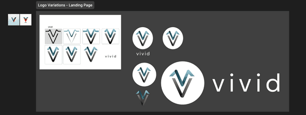
Therefore I came up with the name “Vivid” to point to how this app could help increase the quality of your note-taking experience. I came up with some iterations on the logo from there as well.
They’ll be further posts about the process of actually building out that application beyond the mocks on here as we go.
Creating the UI System and Core Colors
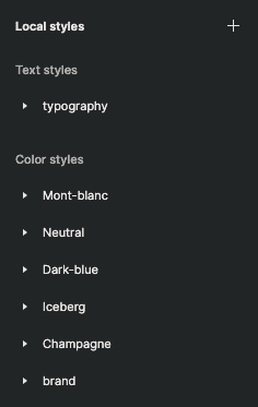
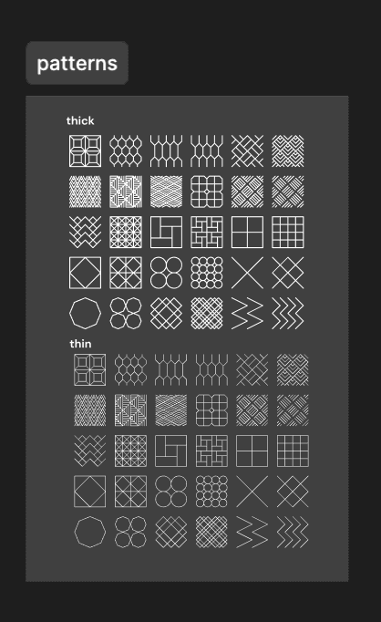
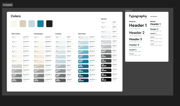
A more comprehensive approach was required this time, and really think about the colors, fonts, and font sizes that would be used across the site and define them as reusable styles. I also figured it would be good to try and pull in as many of the assets that I would be using ahead of time to give myself a good pool of resources to work with.
The icons all come from various free sources on the web (iconex, material, shadcdn, etc.) but I also found some good stuff on this site (kenney.nl) that is fair use.
I picked a core color palette and defined them in the system, using plugins like foundation color generator to help define all of the variations.
I also picked a font and defined some constants to use across the page.
Building out components with variants
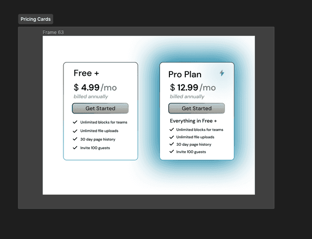
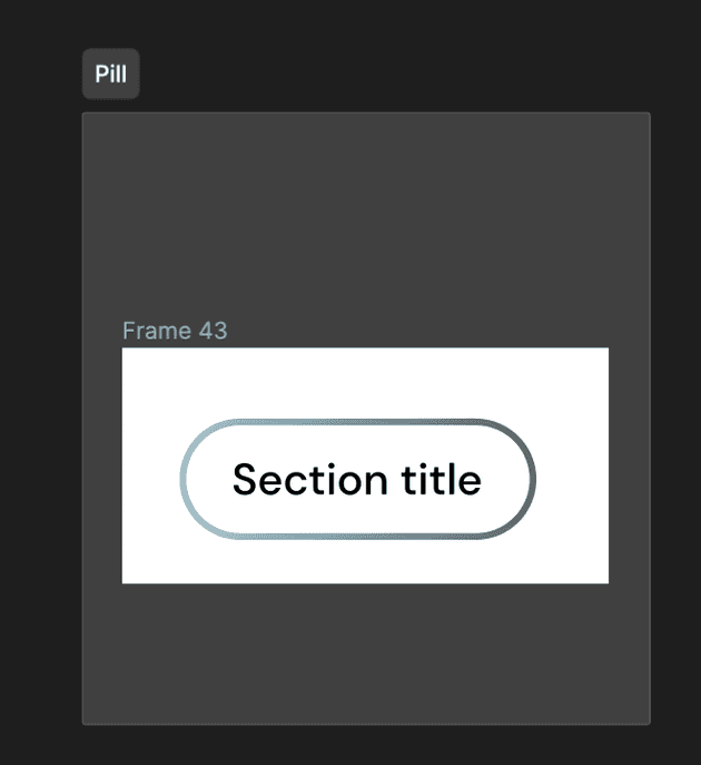
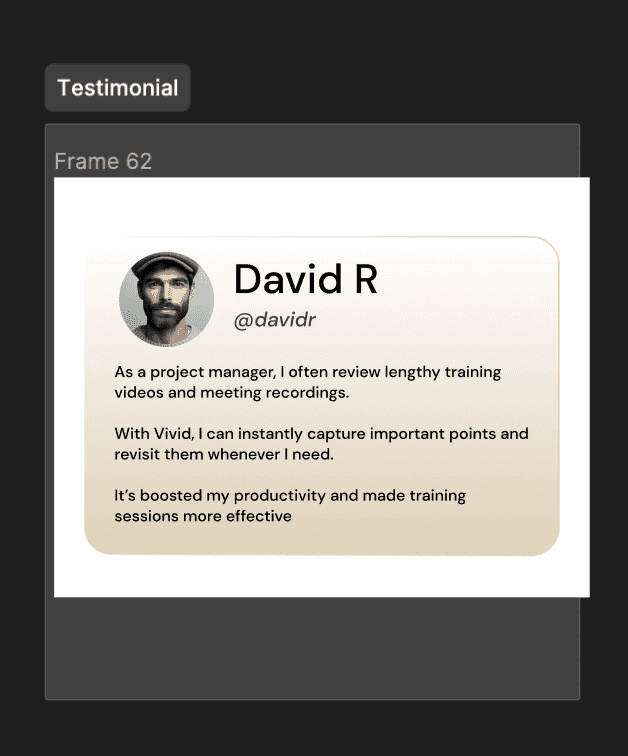
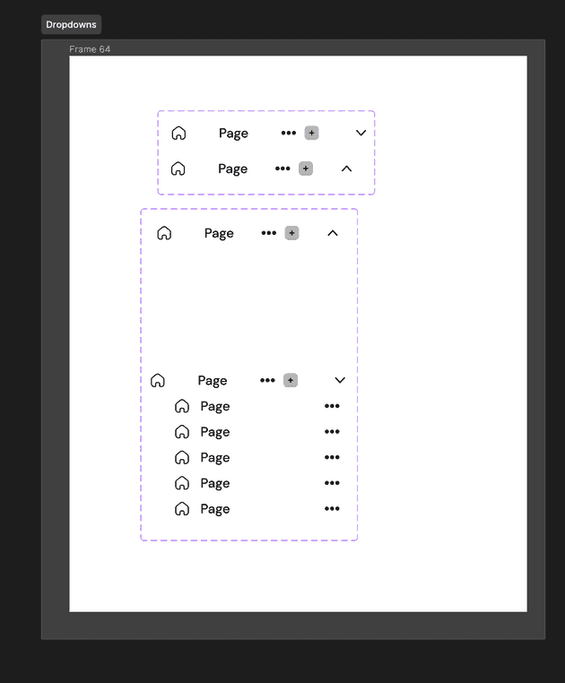
The next step now that all of the resources were in place was to define the core components that would be used on the landing page. The core ones here were:
- Link
- Pricing Card
- Pill
- Testimonial
- Dropdown
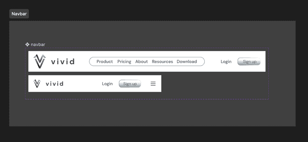
- Navbar
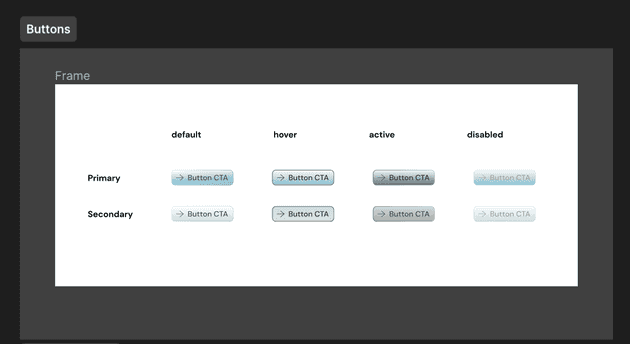
- Button
So I created a separate page in figma to define all of these and defined them as components with different variants and properties to establish all of the different states the components could be in for our actual mock.
Building the App Mock
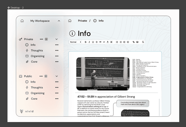
Since I knew I was going to need some version of the actual application to use within the landing page mock, I figured it would be good to get a mock of it (even though all of the features haven’t been scoped out yet)
So here’s a mini representation of what vivid “could” look like. As mentioned before it’s essentially notion (collaborative notetaking) but caterered to video.
Now that we had this, we can put it on our page as a reference to the actual app that folks can purchase.
Creating the Core Desktop Landing Page Mock
I’ve never built out a landing page, so I had to do some research on what they’re typically composed of. What I found was that they usually have:
- A hero section: an attention grabbing headline with a short description
- Feature section: key features that are listed out
- Social Proof: Showing that the app is worth getting
- Call to Action: Some encouragement or easy click button to have users sign up or try the demo
- Pricing: Showing the different tiers and the benefits that come with each.
- FAQ: Some form of common questions answered ahead of time
While these things aren’t universally true as far as them being necessary for all pages, it was a good place to start. I knew that the page needed to be visually appealing, eye-catching and not too cluttered.
I didn’t look at a ton of landing pages for inspiration, but I’m sure I can do this ahead of time before actual implementation of the real one.
I also found a cool open source tool to create landing pages easily that gave me some inspiration as well (page ui) The fade outs, background blur, and highlights were my favorite aspects that I believe added some nice design flair ✨.
See for yourself! Next step is actually coding this up.
Desktop Mock
I then duplicated the same design for mobile by adjusting font sizes and spacing.
Mobile Mock
